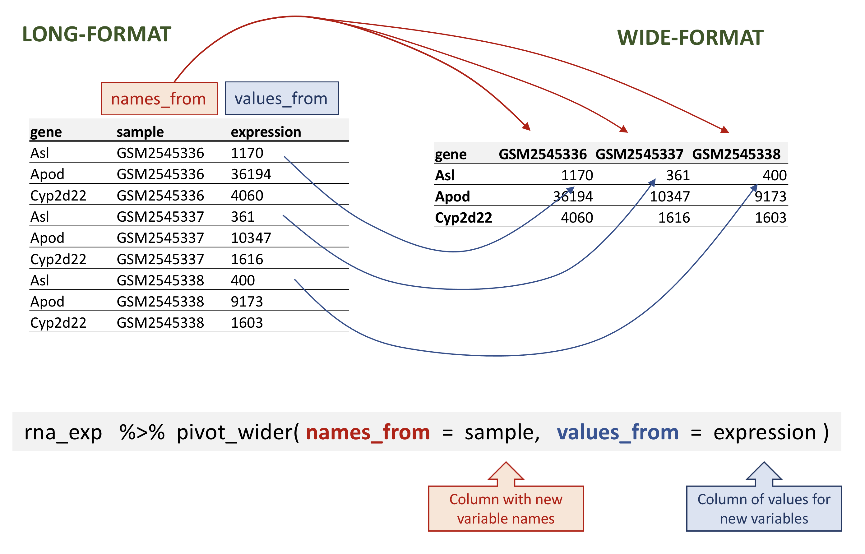
Image 1 of 1: ‘図は左側がロング形式、右側がワイド形式のテーブルを示しており、左側の'sample'列の値が右側の列名に、左側の'expression'列の値が右側の列値に変換される過程を矢印で示しています。以下は'pivot_wider()'関数の呼び出し例で、'sample'と'expression'引数に対応する注釈を付けています’
rnaデータのワイド形式への変換例
Figure 2
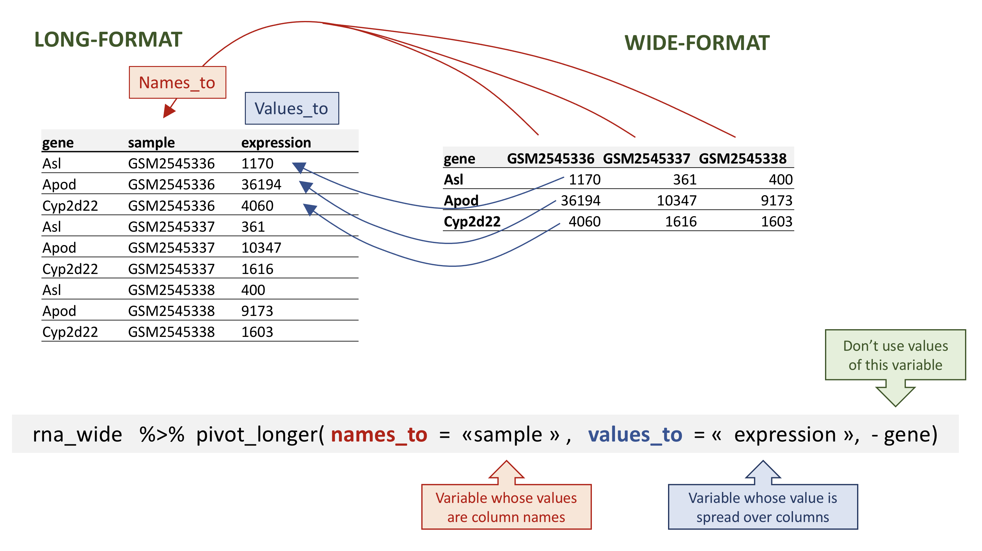
Image 1 of 1: ‘図は左側が縦長形式、右側が幅広形式を示しており、矢印は左側の列名が新しい列'sample'として変換され、右側の値が新しい列'expression'として変換される過程を表しています。以下は'pivot_wider()'関数の呼び出し例で、'sample'、'expression'、および'-gene'引数に注釈を付けています’
rnaデータの縦長変換例
Figure 3
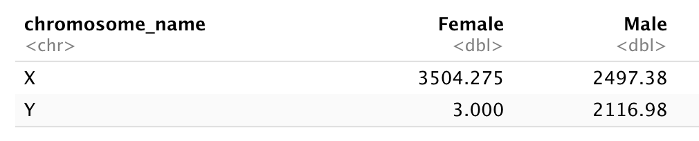
Image 1 of 1: ‘X染色体とY染色体を行名、FemaleとMaleを列名とした2×2の表。各X/YおよびFemale/Maleの組み合わせごとの合計カウント数を示しています。Y/Femaleの組み合わせは3カウントで、その他の組み合わせはすべて2000カウントを超えています’
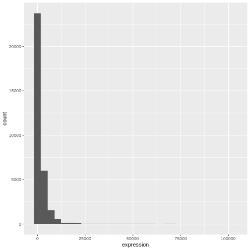
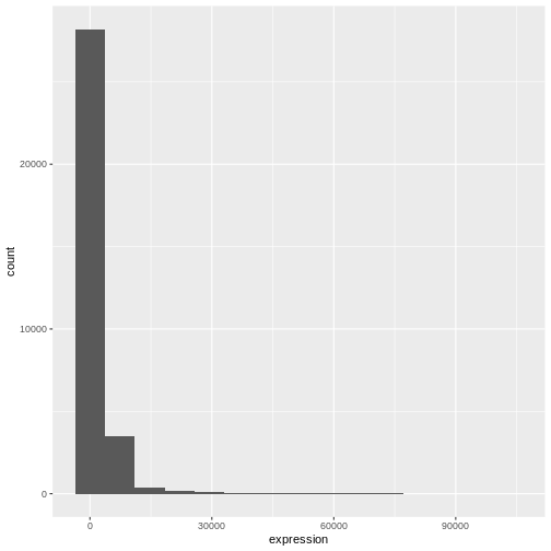
Image 1 of 1: ‘ggplot()とgeom_histogram()で生成したexpressionデータのデフォルトヒストグラム’
Figure 2
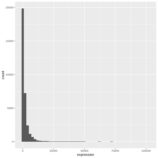
Image 1 of 1: ‘ビン幅15の場合(上)とビン幅2000の場合(下)におけるggplot()とgeom_histogram()で生成された発現データのヒストグラム’
Figure 3
Image 1 of 1: ‘ビン幅15の場合(上)とビン幅2000の場合(下)におけるggplot()とgeom_histogram()で生成された発現データのヒストグラム’
Figure 4
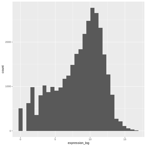
Image 1 of 1: ‘事前に計算した発現量の対数値に基づくヒストグラム(ggplot()とgeom_histogram()で生成)’
Figure 5
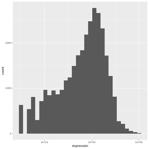
Image 1 of 1: ‘発現量の対数に対する ggplot()、geom_histogram()、および scale_x_log10() で生成されたヒストグラム’
Figure 6
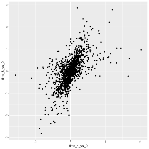
Image 1 of 1: ‘上記で計算した対数2倍変化を比較する散布図。すべての点は黒色で表示されます’
Figure 7
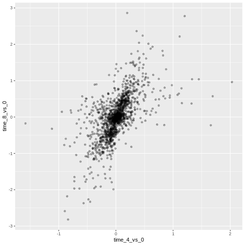
Image 1 of 1: ‘上記で計算した対数2倍変化を比較する散布図。すべての点は半透明の黒色で表示されます’
Figure 8
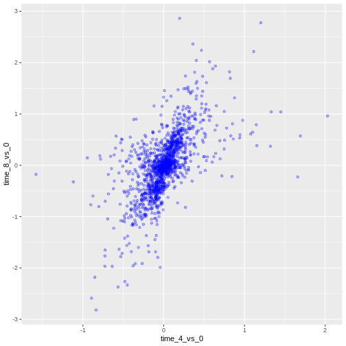
Image 1 of 1: ‘上記で計算した対数2倍変化を比較する散布図。すべての点は半透明の青色で表示されます’
Figure 9
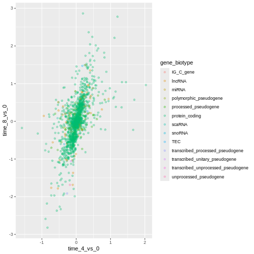
Image 1 of 1: ‘上記で計算した対数2倍変化を比較する散布図。点の色は遺伝子のバイオタイプに基づいて色分けされています’
Figure 10
Image 1 of 1: ‘上記で計算した対数2倍変化を比較する散布図。点の色は遺伝子のバイオタイプに基づいて色分けされています’
Figure 11
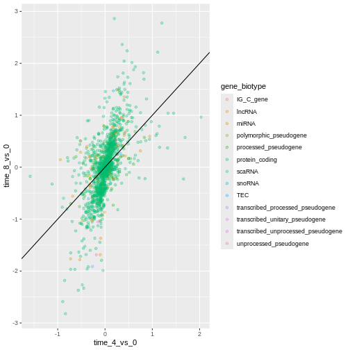
Image 1 of 1: ‘上記で計算した対数2倍変化を比較する散布図。点の色は遺伝子のバイオタイプに基づいて色分けされています。原点を通る傾き1の黒色の直線がgeom_abline()によって追加されています’
Figure 12
Image 1 of 1: ‘Scatter plot produced by ggplot() and geom_point() comparing the log-foldchanges computed above. Dots are colour-coded based on the gene's biotype. A black line of slope 1 crossing the origin was added by geom_abline().’
Figure 13
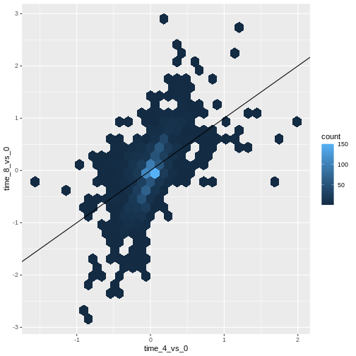
Image 1 of 1: ‘Scatter plot produced by ggplot() and geom_hexbin() comparing the log-foldchanges computed above shows hexagons coloured based on the underlying dot density. A black line of slope 1 crossing the origin was added by geom_abline().’
Figure 14
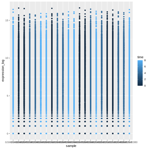
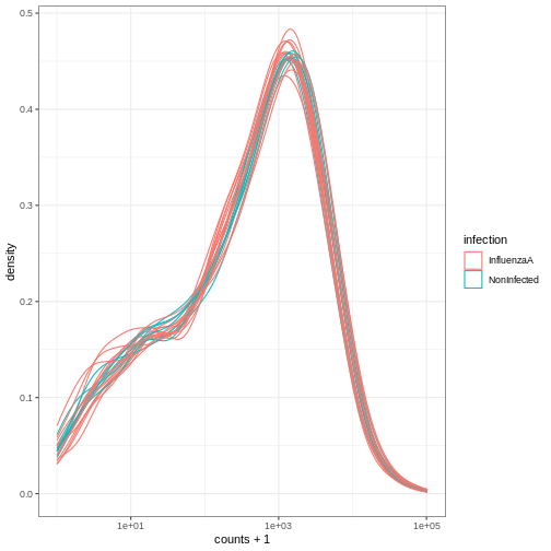
Image 1 of 1: ‘Figures showing a stretch of overlapping points indicating the log of expression + 1 for each sample. The points are coloured with different shades of blue for samples collected at different time points.’
Figure 15
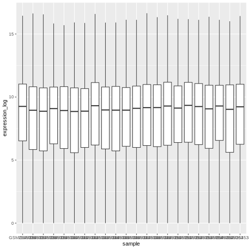
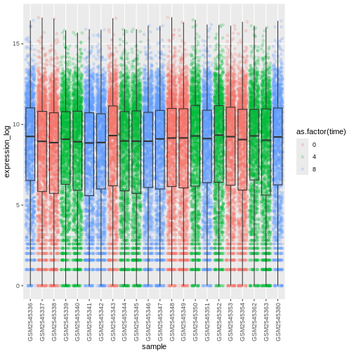
Image 1 of 1: ‘geom_boxplot()によって生成された各サンプルの対数変換発現量+1値の分布を示す箱ひげ図。各箱ひげ図は白色で塗りつぶされています。’
Figure 16
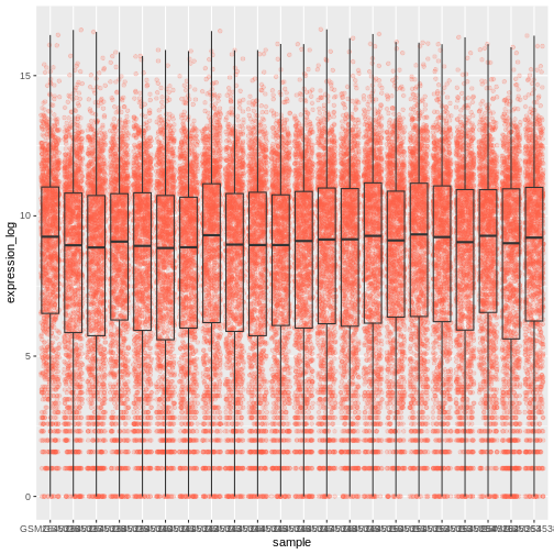
Image 1 of 1: ‘geom_boxplot()によって生成された各サンプルの対数変換発現量+1値の分布を示す箱ひげ図と点プロット。各箱ひげ図は半透明で、ジッター処理された点プロットは半透過のトマト色で表示され、箱ひげ図の背面に配置されています。’
Figure 17
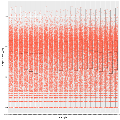
Image 1 of 1: ‘Boxplot and dots showing the distribution of log expression + 1 values for each sample, as produced by geom_boxlpot(). Each boxplot is transparent and the jittered dots are semi-transparent tomato-coloured. This time, the boxplots are behind the dots.’
Figure 18
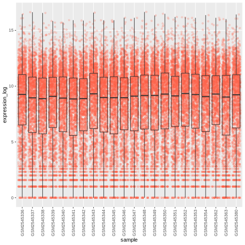
Image 1 of 1: ‘Boxplot and dots showing the distribution of log expression + 1 values for each sample, as produced by geom_boxlpot(). Each boxplot is transparent and the jittered dots are semi-transparent tomato-coloured. The sample labels are displayed vertically and readable.’
Figure 19
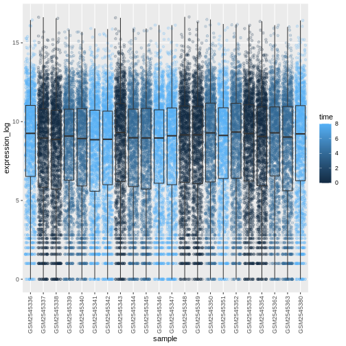
Image 1 of 1: ‘Boxplot and dots showing the distribution of log expression + 1 values for each sample, as produced by geom_boxlpot(). On the first figure, each boxplot is transparent and the jittered dots are semi-transparent and coloured in different shares of blue. On the second figures, each boxplot is transparent and the jittered dots are semi-transparent and coloured red, green and blue.’
Figure 20
Image 1 of 1: ‘Boxplot and dots showing the distribution of log expression + 1 values for each sample, as produced by geom_boxlpot(). On the first figure, each boxplot is transparent and the jittered dots are semi-transparent and coloured in different shares of blue. On the second figures, each boxplot is transparent and the jittered dots are semi-transparent and coloured red, green and blue.’
Figure 21
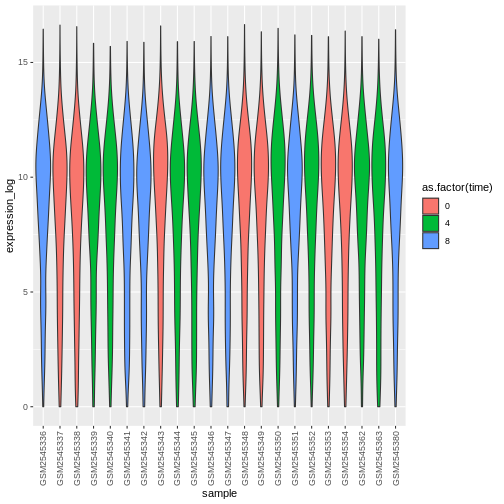
Image 1 of 1: ‘Violin plot showing the distribution of log expression + 1 values for each sample, as produced by geom_violin(). Each boxplot is transparent and the jittered dots are semi-transparent and coloured red, green and blue.’
Figure 22
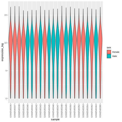
Image 1 of 1: ‘Violin plot showing the distribution of log expression + 1 values for each sample, as produced by geom_violon(). Each violin plot is coloured in red or blue depending on the sex variable.’
Figure 23
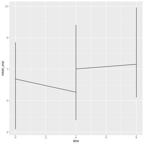
Image 1 of 1: ‘geom_line()で生成した折れ線グラフですが、実際のデータが期待通りの傾向を示していません’
Figure 24
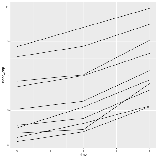
Image 1 of 1: ‘geom_line()で生成した折れ線グラフで、10本の線がそれぞれ異なる遺伝子の時間経過に伴う発現量の増加を示しています’
Figure 25
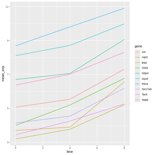
Image 1 of 1: ‘geom_line()で生成した折れ線グラフで、10本の色分けされた線がそれぞれ異なる遺伝子の時間経過に伴う発現量の増加を示しています’
Figure 26
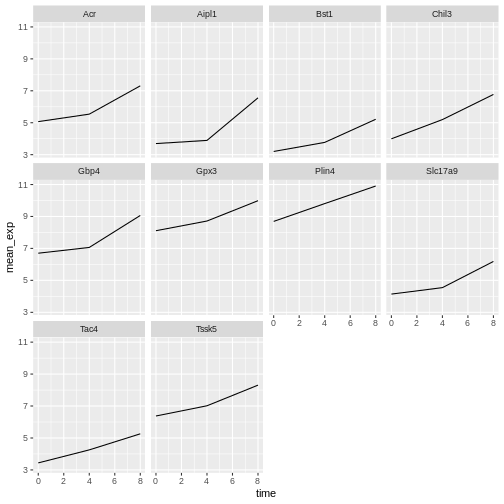
Image 1 of 1: ‘geom_line()で生成した折れ線グラフで、10個のサブプロット/面分割があり、それぞれが時間経過に伴う発現量の増加を示す1本の線を表示しています。すべてのy軸スケールは同一です’
Figure 27
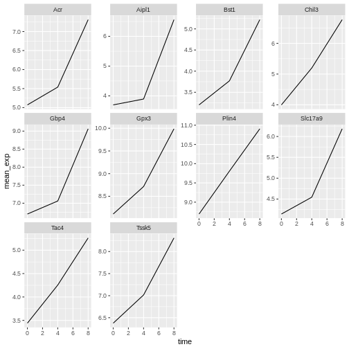
Image 1 of 1: ‘geom_line()で生成した折れ線グラフで、10個のサブプロット/面分割があり、それぞれが時間経過に伴う発現量の増加を示す1本の線を表示しています。各面分割/遺伝子ごとにy軸スケールが発現量の範囲に合わせて調整されています’
Figure 28
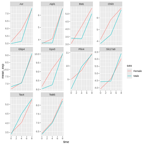
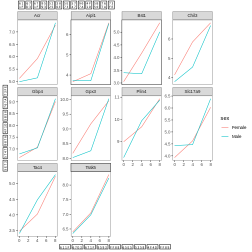
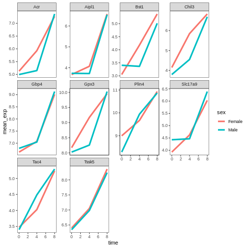
Image 1 of 1: ‘geom_line()で生成した折れ線グラフで、10個のサブプロット/面分割があり、それぞれが時間経過に伴う発現量の増加を示す2本の色分けされた線(メスは赤、オスは青)を表示しています’
Figure 29
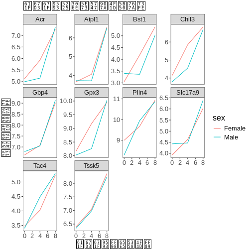
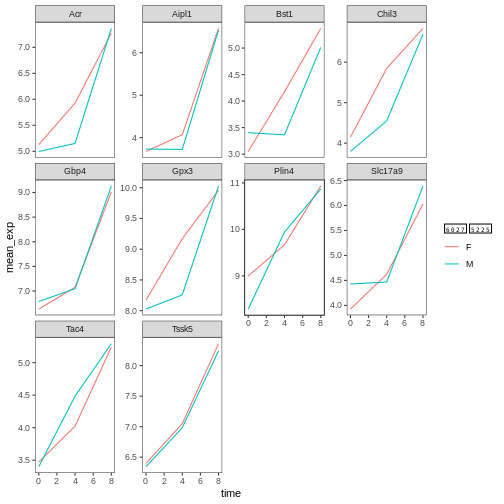
Image 1 of 1: ‘geom_line()で生成した折れ線グラフで、10個のサブプロット/面分割があり、それぞれが時間経過に伴う発現量の増加を示す2本の色分けされた線(メスは赤、オスは青)を表示しています。図の背景が白になっています’
Figure 30
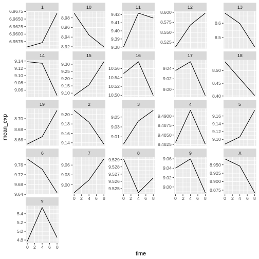
Image 1 of 1: ‘Line plot, as produced by geom_line(), with 21 sub-plots/facets, each showing one line with expression values over time for each chromosome.’
Figure 31
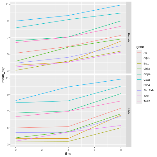
Image 1 of 1: ‘2つの折れ線グラフが上下に配置され、それぞれ遺伝子ごとに10本の線が色分けされています。上部のサブプロットは女性サンプルの発現値を、下部のサブプロットは男性サンプルの発現値を示しています’
Figure 32
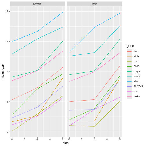
Image 1 of 1: ‘2つの折れ線グラフが左右に配置され、それぞれ遺伝子ごとに10本の線が色分けされています。左側のサブプロットは女性サンプルの発現値を、右側のサブプロットは男性サンプルの発現値を示しています’
Figure 33
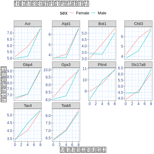
Image 1 of 1: ‘白背景の折れ線グラフで、カスタムタイトルと軸ラベルが表示されています’
Figure 34
Image 1 of 1: ‘白背景の折れ線グラフで、カスタムタイトルと軸ラベルのフォントサイズが拡大されています’
Figure 35
Image 1 of 1: ‘白背景の折れ線グラフで、カスタムタイトルと軸ラベルのフォントサイズが拡大され、グリッドが青色になっています’
Figure 36
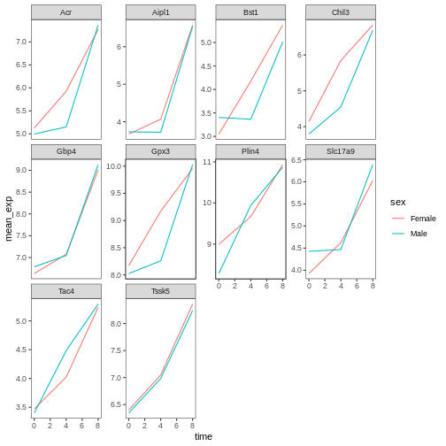
Image 1 of 1: ‘theme_bw()と空白のグリッド上に生成されたシンプルな面グラフ付き折れ線プロット’
Figure 37
Image 1 of 1: ‘theme_bw()と幅広のグリッド線を使用したシンプルな面グラフ付き折れ線プロット’
Figure 38
Image 1 of 1: ‘theme_bw()と名称変更された色ラベルを使用したシンプルな面グラフ付き折れ線プロット’
Figure 39
Image 1 of 1: ‘異なるカラーパレットと名称変更された色ラベルを使用したtheme_bw()と空白のグリッド上のシンプルな面グラフ付き折れ線プロット’
Figure 40
Image 1 of 1: ‘手動で設定した色と名称変更された色ラベルを使用したtheme_bw()と空白のグリッド上のシンプルな面グラフ付き折れ線プロット’
Figure 41
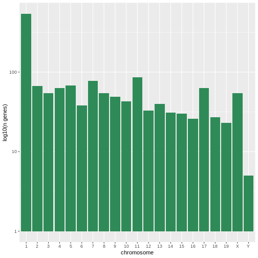
Image 1 of 1: ‘染色体ごとの遺伝子数を対数10スケールで表示したシンプルなヒストグラム(棒グラフ)’
Figure 42
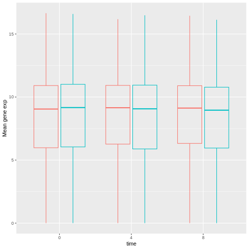
Image 1 of 1: ‘異なる時間ポイントにおける雌雄別の発現値を示す、透明度を持たせた赤と青の箱ひげ図’
Figure 43
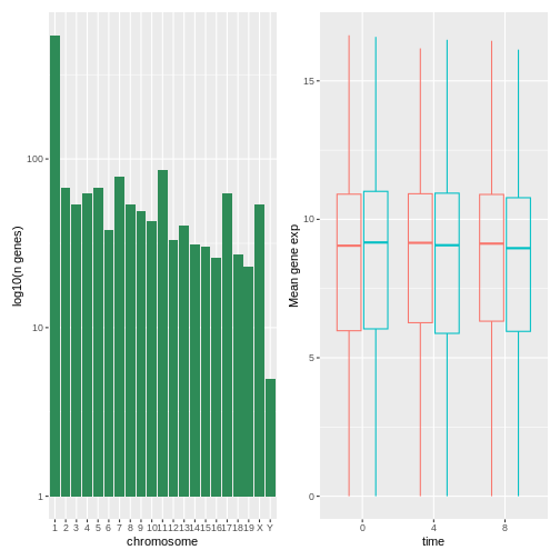
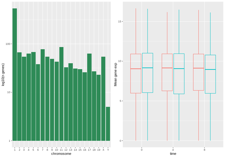
Image 1 of 1: ‘左側にヒストグラム、右側に箱ひげ図を配置した合成図’
Figure 44
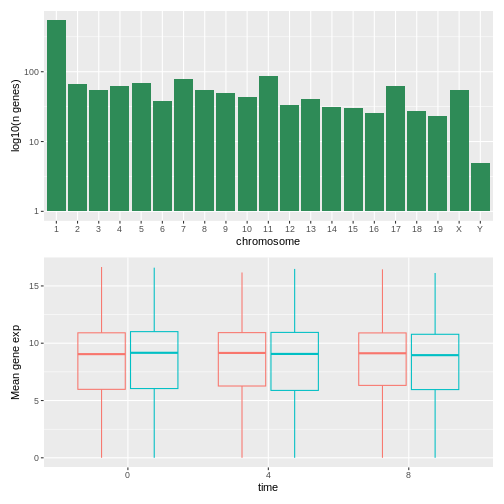
Image 1 of 1: ‘上部にヒストグラム、下部に箱ひげ図を配置した合成図’
Figure 45
Image 1 of 1: ‘上部にヒストグラム、下部に箱ひげ図を配置した合成図’
Figure 46
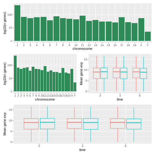
Image 1 of 1: ‘上部にヒストグラム、中央にヒストグラムと箱ひげ図の組み合わせ、左右に並べて表示、下部に箱ひげ図を配置した4プロット構成の図’
Figure 47
Image 1 of 1: ‘上記と同様、上部にヒストグラム、中央にヒストグラムと箱ひげ図の組み合わせ、左右に並べて表示、下部に箱ひげ図を配置した4プロット構成の図’
Figure 48
Image 1 of 1: ‘左側にヒストグラム、右側に箱ひげ図を配置した合成図’
Figure 49
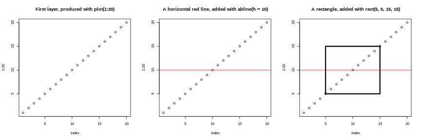
Image 1 of 1: ‘左から右へ、対角線上に20個の空の点、その上に垂直な赤色の線、さらにその上にプロット中央の長方形を重ねた「基本」グラフィックスの比較図’
順次重ね合わされるレイヤー
Figure 50
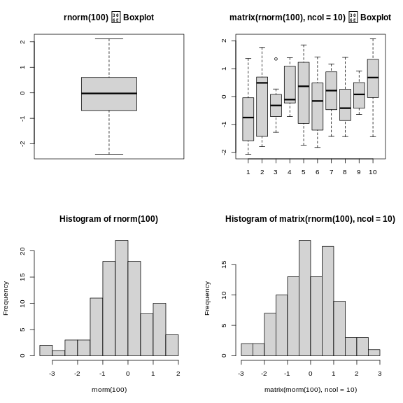
Image 1 of 1: ‘上部に2つのボックスプロット、下部に2つのヒストグラムを配置した2×2の構成図’