Image 1 of 1: ‘Schematic showing the composition of a SummarizedExperiment object, with three assay matrices of equal dimension, rowData with feature annotations, colData with sample annotations, and a metadata list.’
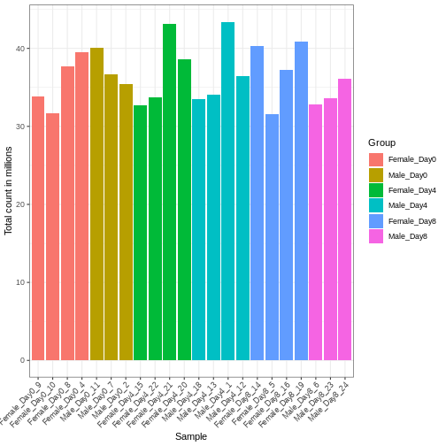
Image 1 of 1: ‘Barplot with total count on the y-axis and sample name on the x-axis, with bars colored by the group annotation. The total count varies between approximately 32 and 43 million.’
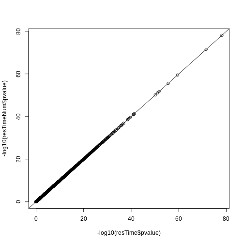
Figure 2
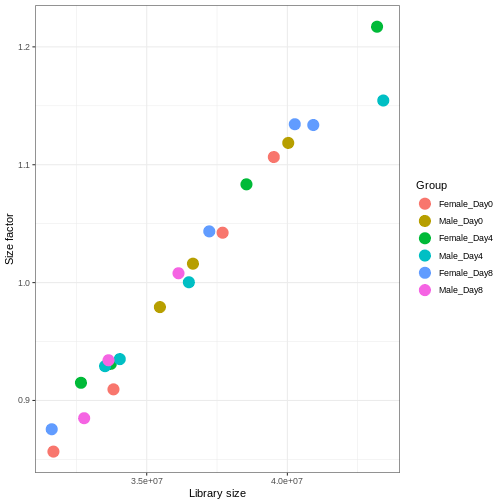
Image 1 of 1: ‘Scatterplot with library size on the x-axis and size factor on the y-axis, showing a high correlation between the two variables.’
Figure 3
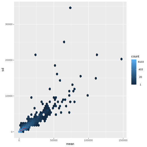
Image 1 of 1: ‘Hexagonal heatmap with the mean count on the x-axis and the standard deviation of the count on the y-axis, showing a generally increasing standard deviation with increasing mean. The density of points is highest for low count values.’
Figure 4
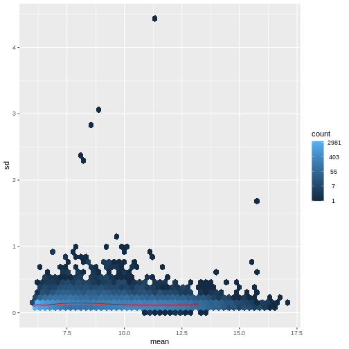
Image 1 of 1: ‘Hexagonal heatmap with the mean variance-stabilized values on the x-axis and the standard deviation of these on the y-axis. The trend is generally flat, with no clear association between the mean and standard deviation.’
Figure 5
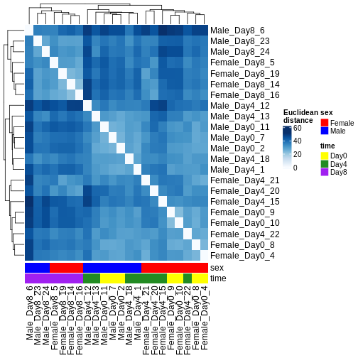
Image 1 of 1: ‘Heatmap of Euclidean distances between all pairs of samples, with hierarchical cluster dendrogram for both rows and columns. Samples from day 8 cluster separately from samples from days 0 and 4. Within days 0 and 4, the main clustering is instead by sex.’
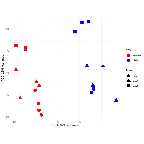
Figure 6
Image 1 of 1: ‘Scatterplot of samples projected onto the first two principal components, colored by sex and shaped according to the experimental day. The main separation along PC1 is between male and female samples. The main separation along PC2 is between samples from day 8 and samples from days 0 and 4.’
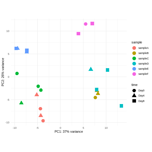
Figure 7
Image 1 of 1: ‘Scatterplot of samples projected onto the first two principal components, colored by a hypothetical sample ID annotation and shaped according to a hypothetical experimental day annotation. In the plot, samples with the same sample ID tend to cluster together.’
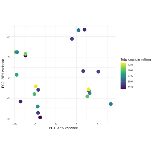
Figure 8
Image 1 of 1: ‘Scatterplot of samples projected onto the first two principal components of the variance-stabilized data, colored by library size. The library sizes are between approximately 32.5 and 42.5 million. There is no strong association between the library sizes and the principal components.’
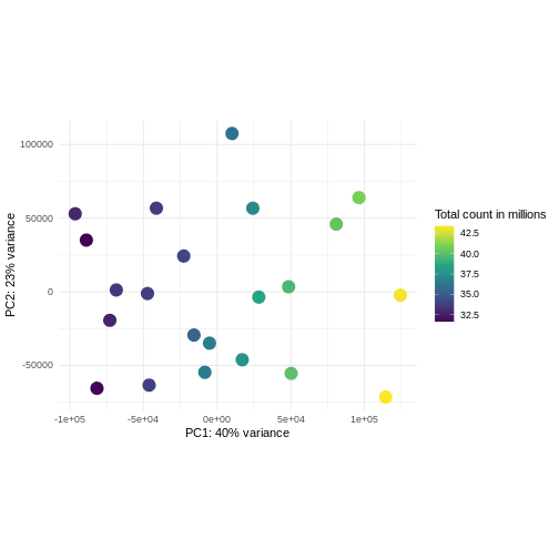
Figure 9
Image 1 of 1: ‘Scatterplot of samples projected onto the first two principal components of the count matrix, colored by library size. The library sizes are between approximately 32.5 and 42.5 million. The first principal component is strongly correlated with the library size.’
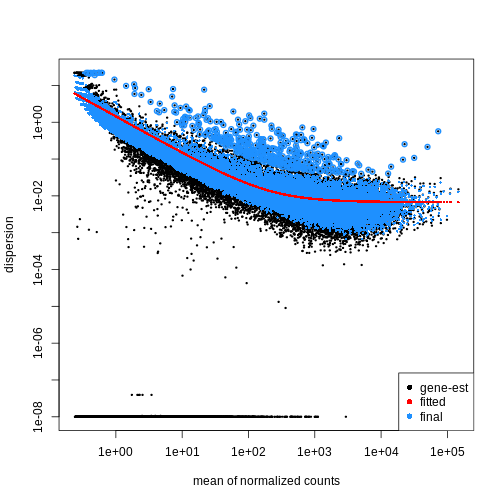
Image 1 of 1: ‘Scatterplot with the mean of normalized counts on the x-axis and the dispersion on the y-axis. The plot shows black dots corresponding to gene-wise estimates of the dispersion, a red line corresponding to the fitted trend, and blue dots corresponding to the final dispersion estimates. There is a general trend of decreasing dispersion with increasing mean normalized counts.’
Figure 2
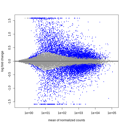
Image 1 of 1: ‘MAプロット:x軸に正規化後の平均カウント数、y軸に対数倍率変化量を表示。有意に発現変動した遺伝子は青色で表示されています。平均正規化カウント数が少ない遺伝子ほど、対数倍率変化量の範囲が広くなっています。’
Figure 3
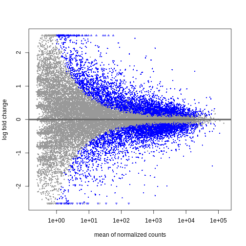
Image 1 of 1: ‘MAプロット:x軸に正規化後の平均カウント数、y軸に縮小処理された対数倍率変化量を表示。有意に発現変動した遺伝子は青色で表示されています。平均正規化カウント数が少ない遺伝子の対数倍率変化量は、ほとんどがゼロに近い値に縮小されています。’
Figure 4
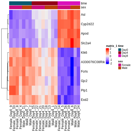
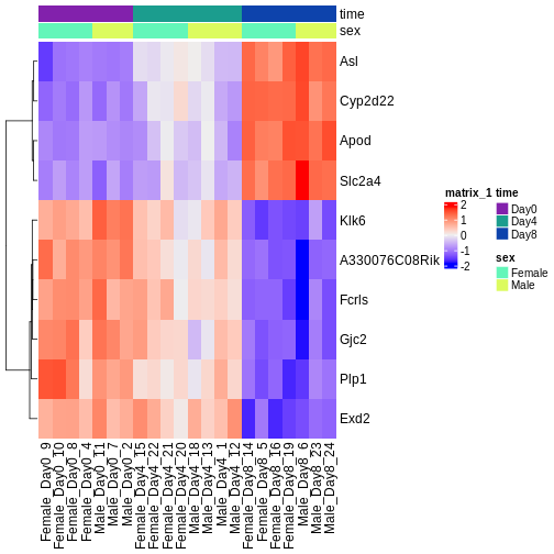
Image 1 of 1: ‘Heatmap showing the vsd-transformed expression levels for the ten most significantly differentially expressed genes over time, in all the samples.’